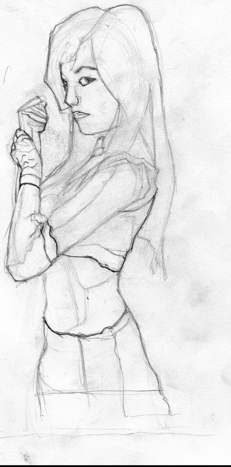
Fall 2012 was very very difficult time and i was struggling through a ton of things and realized that i cannot design when i don't have the foundation down. it was a completely disastrous and lot of things went through my mind... questions went through my mind... "do i want to continue this?".... wanted to stop so many times.... a lot of things have been on my mind since then but regardless i wanted to update my blog (since its been a while and show some of the stuff i have been up to)
here is some of the stuff i completed during September - December 2012.
the way the images are shown are based on the class. its divided by classes. so the next class will begin after the long line. and the images are presented chronologically from setpember to december 2012.
________________________________________________________________
one of the other classes i was taking was industrial design.
our first assignment was to design a weapon based in a universe. i believe our choices were lord of the rings.
Nausicaä of the Valley of the Wind and i forget the other...
i picked lord of the rings and chose to design a bow


so here are some ideas.

and the final.. my instructor had us try a little 3D.. i used sketchup and attempted to put some color in it.
this was done in the month of september 2012
_________________________________
then went on to design sword designs.


so the idea was to have different tiers that the player would use to upgrade. so i provided 4 tiers.


and as noted in at the bottom i was not referencing at all when it came to the color part so i stayed away from it for now.
one thing im still struggling with is trying to understand the idea of referencing.. and how to use it in your own work.
but here was the final...


did one final attempt with color ( should have left it)
this was done during the month october 2012
________________________________________________
and the final project was to do a car design. i always wanted to do a sports car so i decided to do something like that.

i drew over existing cars which some of you would definitely recognize. but i had no idea how to design a car. so wanted to understand the shapes.

cars are very difficult to design. drawing in that 3/4 view is the reason why i need to practice more foundations.
__________________________________________________
the next class
some of the color studies that i did through the fall 2012. (need to do tons more of these)


some are from other concept artists / artists. and some are from photos. (re uploading here as show of reference . copyrights to the originals and their respective owners. )
these were some ways our instructor showed us to study bc it was evident that i needed the practice.
__________
this last one was something i did on the side (when i wasnt too frustrated to draw). black and white figure study done in photoshop.

__________________________________________________________
and here were some designs i did for the class these were done in september 2012
the hangar that would be located in the environment

some thumbs

worked on some ideas. was thinking about doing a stone hedge idea with the base / hangar that was underground


attempted to draw out simple shapes in 3ds max. had to try and learn 3D as well as the program 3dsmax (complete nightmare)... i was just searching for ways to solve the problems i was having.

__________________________________________________________________
here was an airplane design i attempted to do.

scott robertson is really helpful. tried to study his gnomon dvd and apply it to my own work.


some thumbs

i was struggling with drawing thru the form so i tried to set up a perspective system to do this and try to help me out. see how that would work. so much work it was insane. drove me crazy because i did not understand perspective at all. and cannot draw through the other side.

this was probably one of the most frustrating designs i worked on this past semester. here was what i ended up with. i didnt even attempt to paint it.
__________________________________
these environments were done in September 2012.

some attempts on thumbs

ortho view based on a thumb

zoom in view at some of the plant life growing on the cliffs.
______________________________________________________________
and the last class

this was the final for our turn around orthographic based on Valves Team Fortress 2. I did the Spy class . this is where the trouble began. the shapes are off. my line work was really wobbly... completed in the month of September. (copyrights to Valve and original character belongs to Valve). these orthos are used to present to the 3D artist so they understand the shapes they must make in the game.
______
the next project was going to be based on capcoms Monster Hunter...


the idea of the game is you defeat the monster and wear some of its armor. so coming up with character designs thumbs for it. my instructor thought this was too advanced for me ( i agree with him) so he had me go back to basic under drawing to understand how the armor would look on the human figure.
and since i wanted my character to be a female. i chose a female.

as can be seen in the notes i had forgotten everything i learned in figure construction. the problem is i haven't absorbed and applied it to any of my designs. none of the stuff i have learned were being applied to the designs i was doing. very evident that i need more practice and time.

another attempt at some character design thumbnails.
my instructor then saw it fit i just use modern armor that is not fantasy but in real life and use it on top of my character. in other words go off armor that has been made in our world. find photos and use them as base for the design.

so this was the reference i used on the left and would try to put this armor on the character seen on the right

playing with some more female thumbs based on the ref.


the reference i used for the model wasnt working. i then was provided with reference from my instructor, he wanted to see where i was going wrong. so having the reference with the right pose (that he was familiar with) i would use this male person as the base of my model for the armor design. (which was still going to be based on real life armor) i wasnt going to be designing my own.

here is the new reference of the armor i would be using.


as you can see i was struggling very hard to paint. i have no idea how to paint armor and make it look 3D which is why my instructor had me working like this to begin with. wanted me to get from painting 2D like and paint 3D .

the right arm was the most i could do .. i realize that i need to practice painting much much more so i can get faster at it.

this was a color exercise he had me do since i did not finish my character design. using the colors of the creature and applying it to the armor on the left. playing with Photoshop gradient to come up some colors the character. THE original design was one of Capcom's artist that originally worked on the game. please note i did not Draw this character i just applied the color layer on top to a design already done by a professional artist. copyrights to the their respective owners.
_________________________________________________
our final assignment for the semester was creature design. december 2012


so tried the same thing referencing some animals

decided to go with a monkey like creature so did iterations off of that. and this was my final.


i need to practice with color a lot more. but the design is originally mine with appliance of a color layer on top. definitely know what i need to really focus on and is evident in the work that you see.
________________________________________________________________
and as you can see it was really really stressful...
i could never solve the problems.
this is probably the reason why i honestly did not want to post in the first place. it was such a horrible semester for me. nothing was working out. everything i did for those 6 months i was not able to solve any of my problems with the designs.
that being said i buckled down over the break and went back to the basics. i need my 2D drawing foundation skills to get better and i needed to draw more like alot more.. i mean lot more. one thing i did not do enough of was studies on the side or even draw enough of. time needed to be spent doing studies as i was doing these assignments. i see why everyone says this really does take all of your time away . bc its exactly what needs to be done. so i talked some sense into me found some inspiration and just drew...